How to transform a time consuming, complicated form into an intuitive and effortless experience for users?

Duration: 3 weeks
Team: 2 UXUI designers
Role: UX/UI designer -
Responsibility: Research synthesis, create wireframes and prototype for usability testings, developed a framework for all modules, update design system, client management and documentation.
Methodology:
Stakeholder Interviews
Business analysis
Affinity Mapping
Design Studio Ideation
Sketching
User Flow
Wireframe prototyping
Usability testing
Tools:
Mural
Miro
Figma
Google Suite (All)
Slack
Zoom
Problem: Suppliers find it hard to fill in and update their sustainability practice in different learning modules on the type forms
Challenge: To improve the process for suppliers in providing information on their sustainable practices and accommodate both small and large suppliers with different practices.
Outcome: Create a dynamic platform and suppliers can choose to focus on areas they want to highlight and update as develop.
Forms that capture suppliers’ sustainability practices are not built in the internal system, we will be working on the current process in updating suppliers’ sustainability practices on givvable’s platform.

Process
We were able to evaluate the current form and identified pain points and challenges and where it didn’t meet good form design practice and utilised the content research already conducted by giveable into how and what the suppliers feel. Then developed MVP and key features, wireframing and prototyping and conducting usability testing with suppliers. We also conducted guerilla testing to identify more general pain points and make it as accessible and user friendly as possible. Form and survey design guidelines are implemented to provide a consistent experience.

User flow (Before)
Problem

The modules are currently presented on Typeform.
Suppliers find it hard to fill in & update their sustainability practices as they improve and focus on areas they want to highlight.
This results in a high bounce rate, difficulty in getting new suppliers registered and ineffective matching between buyers and suppliers.
Evaluation of Design Form Practice
Evaluating the current form with Jakob Nielsen's Classic 10 usability heuristics and identifying pain points, challenges and where it didn’t meet good form design practice, allow us to identify possible opportunities and features to create a better users’ experience.

Synthesizing Research
In order to root out false alarms rather than identify all usability problems, we decided to study the pain points and concerns from suppliers’ perspectives. Although we are not able to conduct research to understand the pain points of suppliers during the onboarding journey and the struggles when they are filling out the form among the learning modules, we were able to utilise the content research already conducted by giveable into how and what the suppliers feel, label different elements of what they’ve said and develop spontaneous concepts of what should be bear in mind while designing.
1. There’s a concern that small businesses will be penalised if they don’t answer everything in the modules even though some topics are not applicable to a small business
2. Suppliers have a hard feeling when they select “no” as they did not practice certain sustainability practices.
3. The benefits of completing the module are not clearly outlined to suppliers. They don’t understand the purpose and benefits of filling those modules and how will the information be used.
4. They are not motivated to fill in/update their practice
We considered research insight into concrete users’ problems and eventually developed possible solutions with the HMW Statement.
HMW ensure fairness?
HMW avoid hard-feeling?
HMW communicate the benefits and purpose of filling in modules to suppliers?
HMW motivate suppliers to complete the modules?
Developing MVPs
Feature prioritisation list
Two-by-two matrix (Importance/Feasibility)


Develop
Does It Actually Work?
Usability Testing
Conducted usability testing with 3 suppliers and guerrilla testing with 5 general users

Before

After
1. Side Panel default open, avoid confusion
2. With feedback on the last update and completed modules highlighted with a tick, suppliers are motivated to fill in the form by being able to visualize the process and have a sense of progress
3. Suppliers can select relevant sections and hover over sections to check if it’s relevant to them, it’s effective to remove the feeling of unfairness

Before

After
Suppliers are able to skip irrelevant sections with questions greyed out text as default (unclickable) to avoid confusion
Buttons like “Save and Exit” & “ Save and skip to the next session” to reduce the anxiety of unsaved progress

Before

After
When navigating to a different section with the pop-up text box and “save and proceed” button to reduce the anxiety of lost progress
Key Insights from 2 rounds of usability testing:
1. Users find it hard to differentiate different topics
2. Users are confused with different sections on the home page
3. Users do not know how to navigate back
4. Users questioned about where to find the modules
5. Users are confused with the actual content/questions & find it contradictory

User Flow (After)
Deliver

Direct to Dashboard
For New suppliers, they can go to the dashboard once they are registered.
All modules are shown to tell suppliers what to expect.


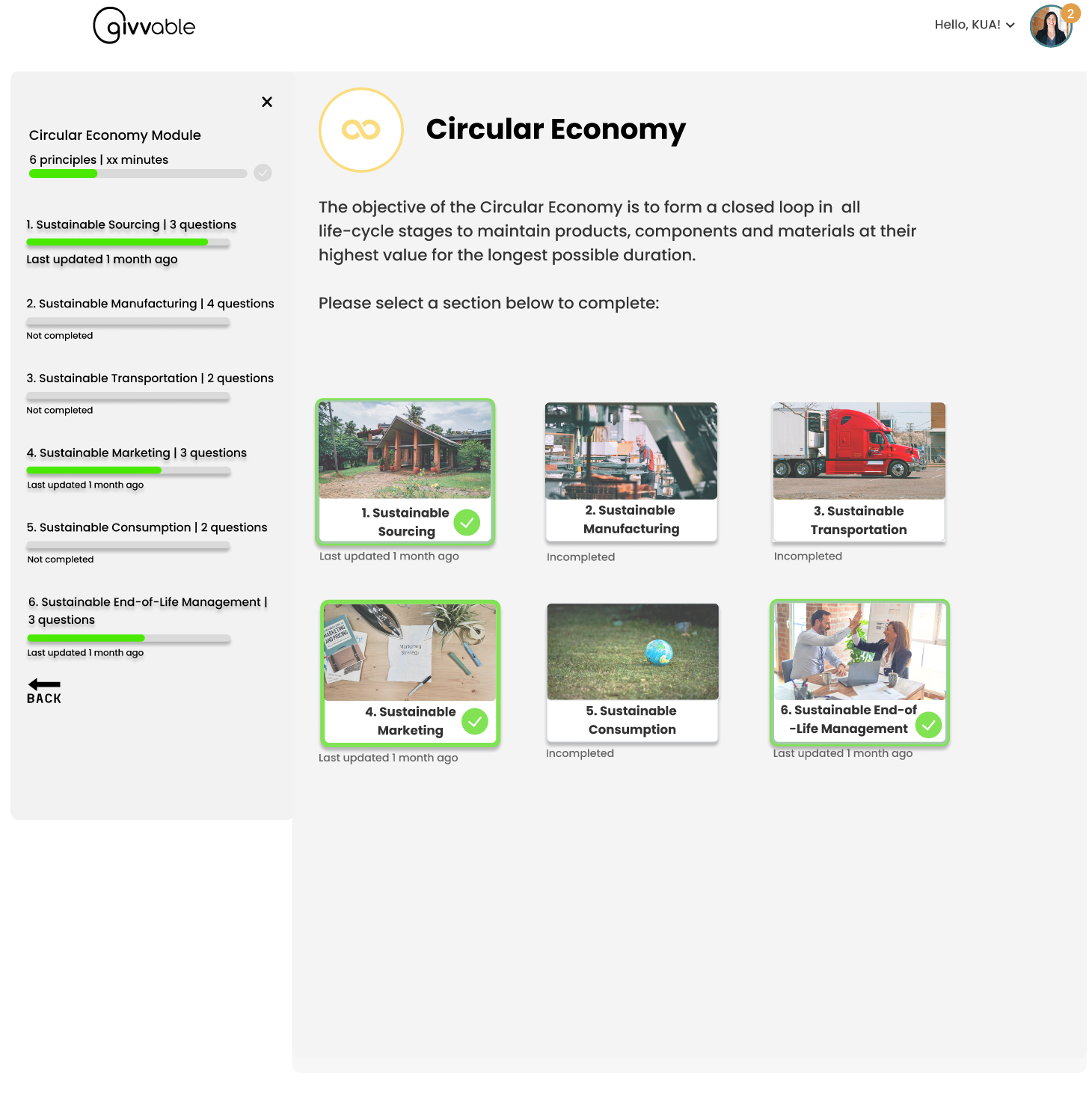


Update Anytime
For New and existing suppliers, they can manage and update different modules in the dashboard and are able to visualize the last update time and completion rate.
Visualize Progress & Ensure Fairness
Suppliers can visualize the process and have a sense of progress with the sidebar. They can select topics that are applicable to them.
Avoid hard-feeling
Suppliers can select not applicable if the topic is not applicable to them. The questions are still visible but greyed out. There will be a pop-out remainder if suppliers would like to jump to different sections through the side panel.
Form & Survey Design Guideline
Ensure the language and the way questions and answers are written are consistent to maintain familiarity and learnability for users.
Ensure error message for required fields is indicated. Suppliers are able to aware of the unfilled required questions with immediate feedback and reduce frictions in filling the module.

An example to display error indication
Design System


Constraints:
1. Not able to conduct user research to understand the pain points of suppliers during the onboarding journey and the struggles when they are filling out the form among the learning modules.
2. Usability test with time constraints, more challenging to get access to B2B users
3. The content can’t be changed while designing the form of experience.
What I learnt:
Do not stick to one approach
Be flexible in the design process, it’s less important if it’s agile or lean UX, and more important to be adaptable and stay focused on the scope and goal. It’s important to get clear how our work ties in with the business goals/rules as well as the user’s needs.
Ensure everyone’s on the same page
The design review is not only the designer’s job. Working together with different stakeholders early on in the project makes the design process and feedback delivery easier. It’s important to make sure the whole team within the company is sharing the goals and constraints in terms of time, resources and effort.
How I will implement these learnings:
In future, we will always ensure we help the client to understand why they are doing what they are doing, how what we are doing will help them drive their goals, or if we are working on untested assumptions. And always make sure deliverables provide value to your client and match their business goals.